Durance bookshop branding
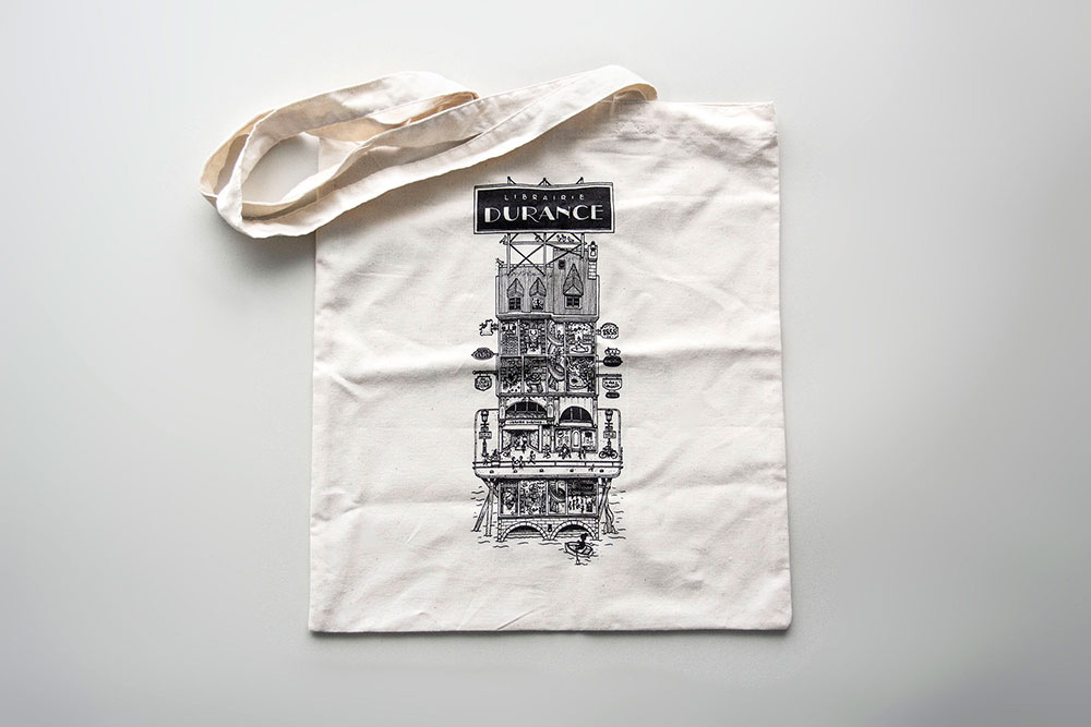
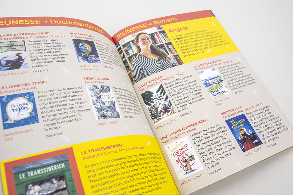
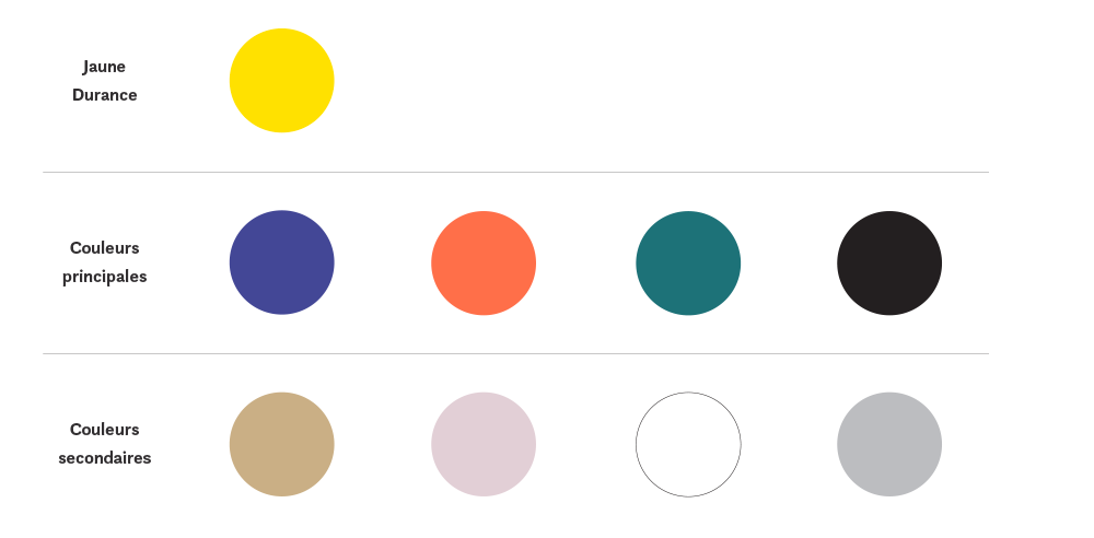
Founded in Nantes in 1858, the oldest of Nantes bookstores, Durance, called on a creative trio to redesign its visual identity: Doctor Paper for illustration, Benjamin Reverdy for project management and myself for typography and artistic direction. A long-term project which aimed to reposition the bookstore as a place of passage and life for readers.
Strategy and project management: Benjamin Reverdy Illustration: Docteur Paper Printing: Allais Photo: papierplie

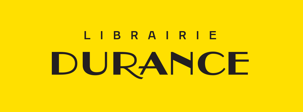
A new contemporary logo that evokes a history and a place
The new logo highlights the name "Durance" by replacing the term "bookstore" in the background. The "L" from the old logo for "Leon" Durance (the founder) is deleted for clarity. The lettering is redesigned to give it more strength while maintaining its art nouveau aspect.
Contrasted type choices
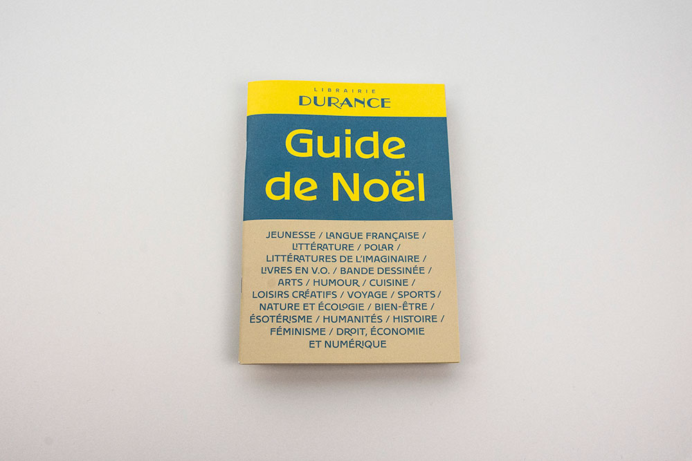
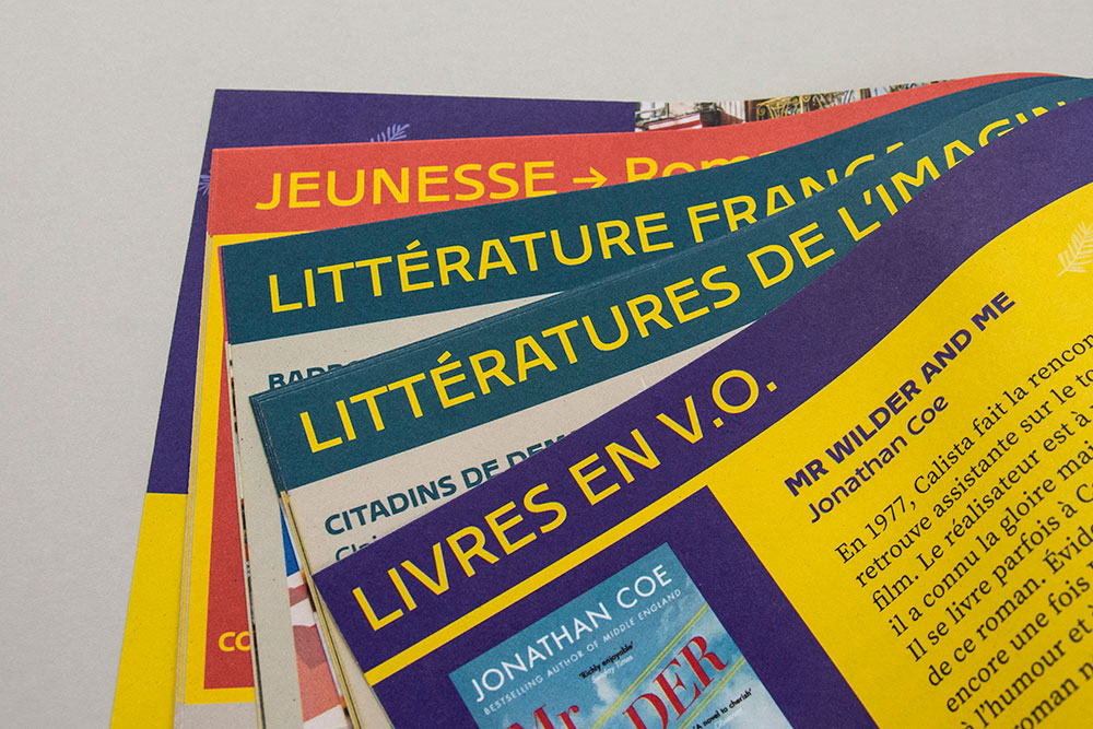
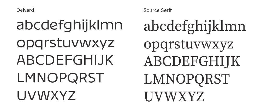
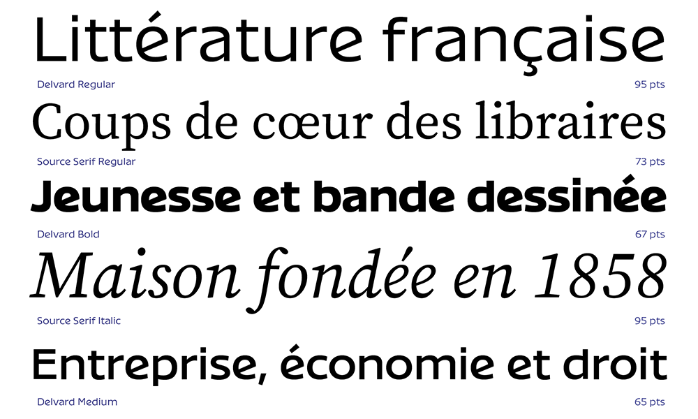
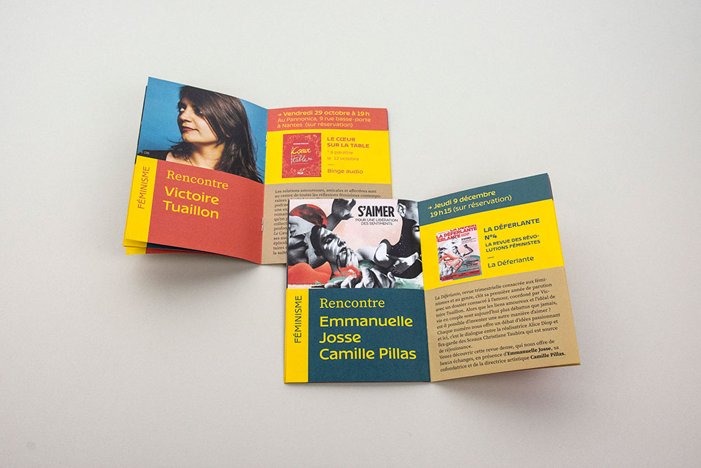
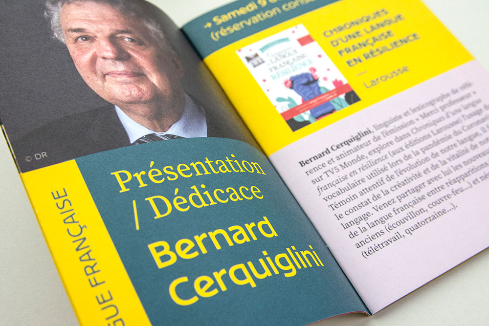
The typeface used, Delvard, is inspired by art nouveau posters and the graphic decade which saw the birth of the Durance bookstore (end of the 19th century). Its large proportions and lack of contrast make it readable, both for titles and for running text. Source Serif is an open source serif typeface that complements Delvard and optimizes the hierarchy of information.
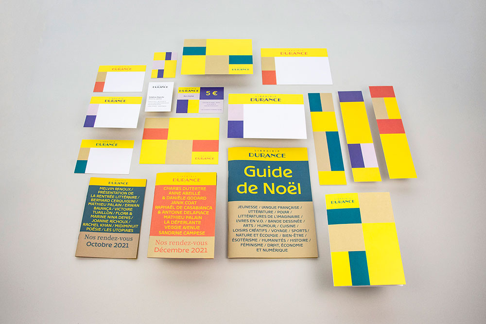
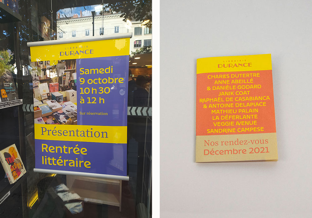
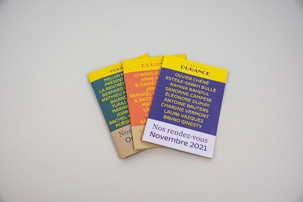
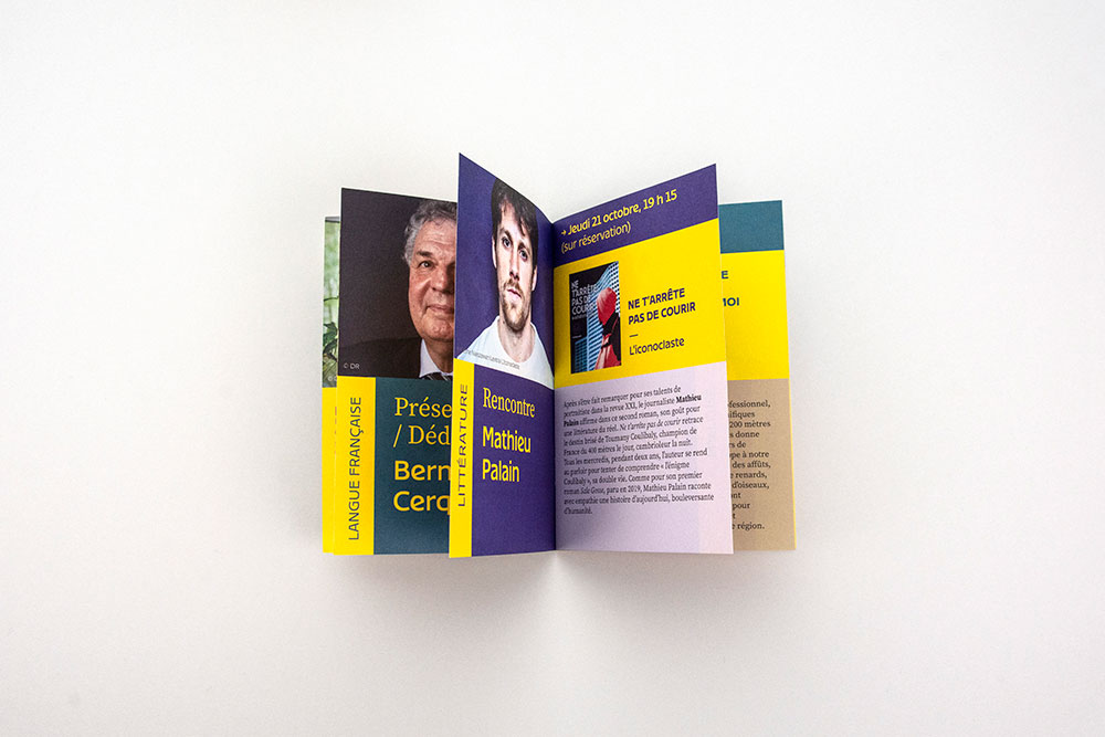
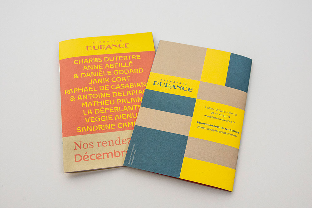
A modular graphics system
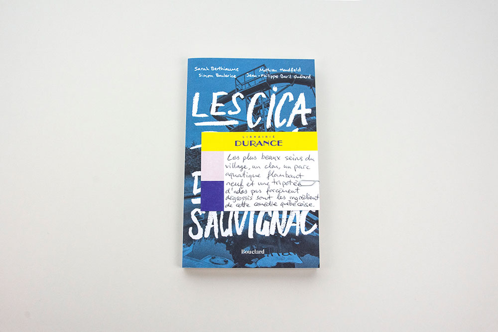
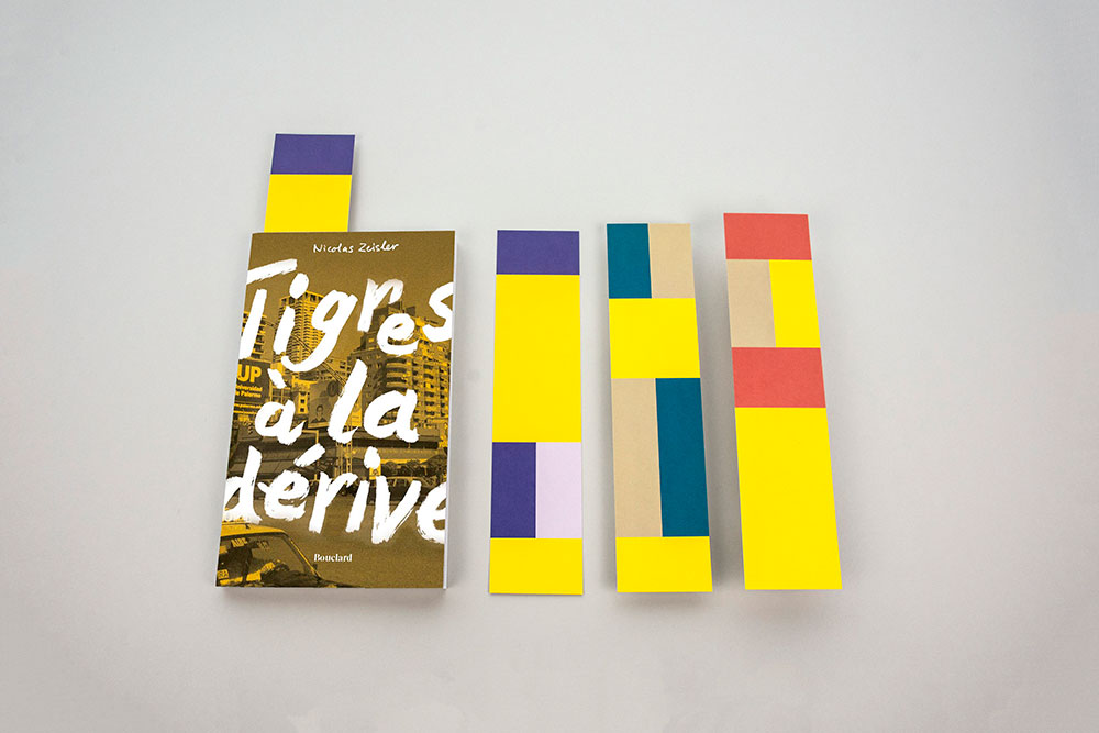
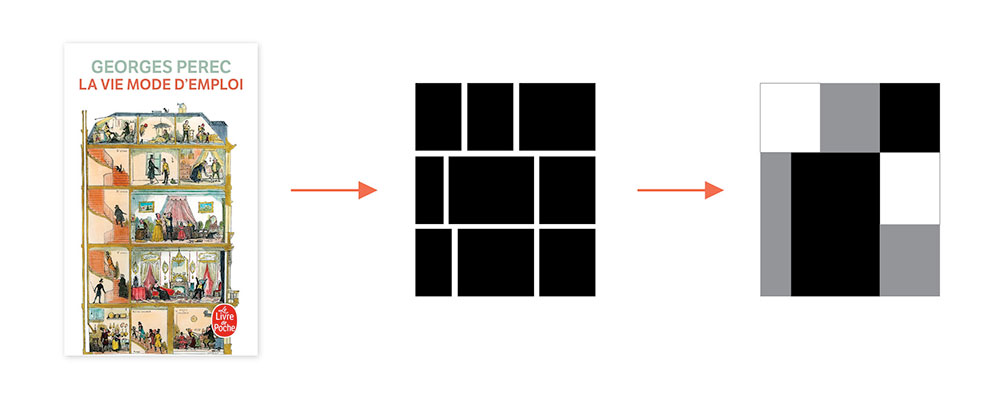
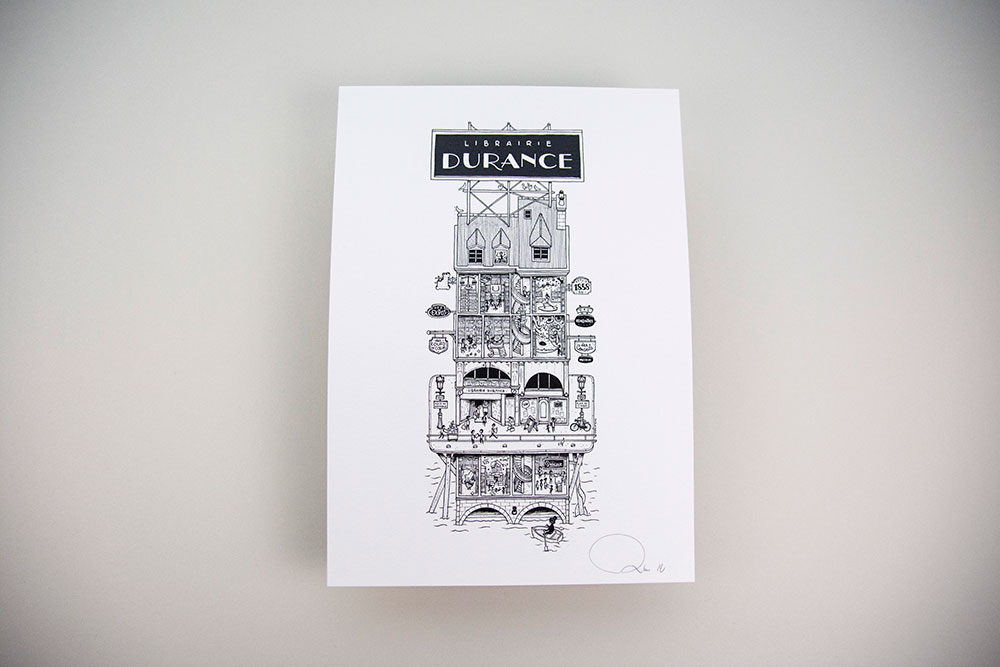
The graphic system or layout principle echoes Perec's novel La Vie mode d´emploi (a so-called "exhaustive" novel as one would expect from a generalist bookstore). He places the observer in front of what could look like a building made up of several floors ... Each one representing a shelf of the bookstore symbolized by blocks of colors. The whole can also evoke a shelving unit assembling sizes and shapes of different books (large format, pocket, comic book, etc.). The modular and multiple graphics system thus created is easily adaptable internally.
An evolving identity
Each year, an original illustration comes to play with the new identity and imagine a “visual extension” for it. It was entrusted in 2022 to Doctor Paper.
