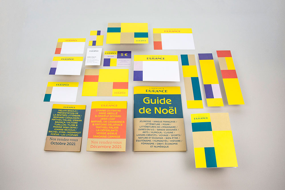
Durance bookshop branding
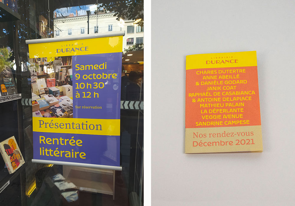
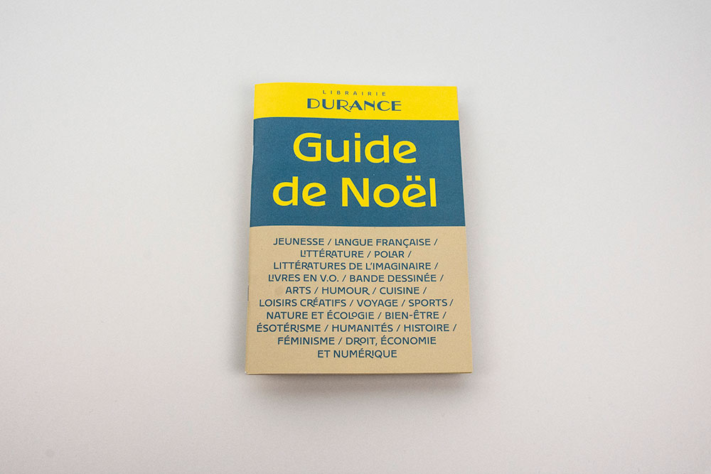
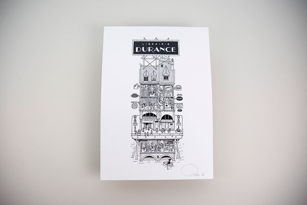
Redesign of the visual identity of the Durance bookstore in Nantes, founded in 1858. The idea was to preserve and enhance the history of the place while modernizing the visual identity. The concept was to see the bookstore as a house with different rooms evoking the different shelves of the bookstore (youth, literature, comics, university ...)
Strategy and project management: Benjamin Reverdy
Illustration: Docteur Paper
Printing: Allais Photo: papierplie
Expertises
- Logo
- Identié visuelle
- Édition
- Charte graphique
- Papeterie

A new contemporary logo that highlights the history of the place
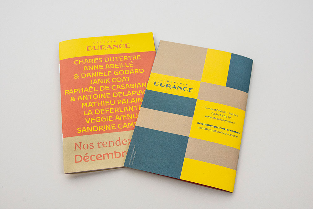
The new logo enhances the Durance name by putting the bookstore name in the background. The -L- of the old logo for Léon Durance (the founder) is deleted. The word Durance is redesigned to give it more strength while retaining its Art Nouveau appearance.

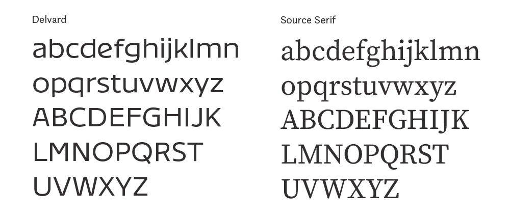
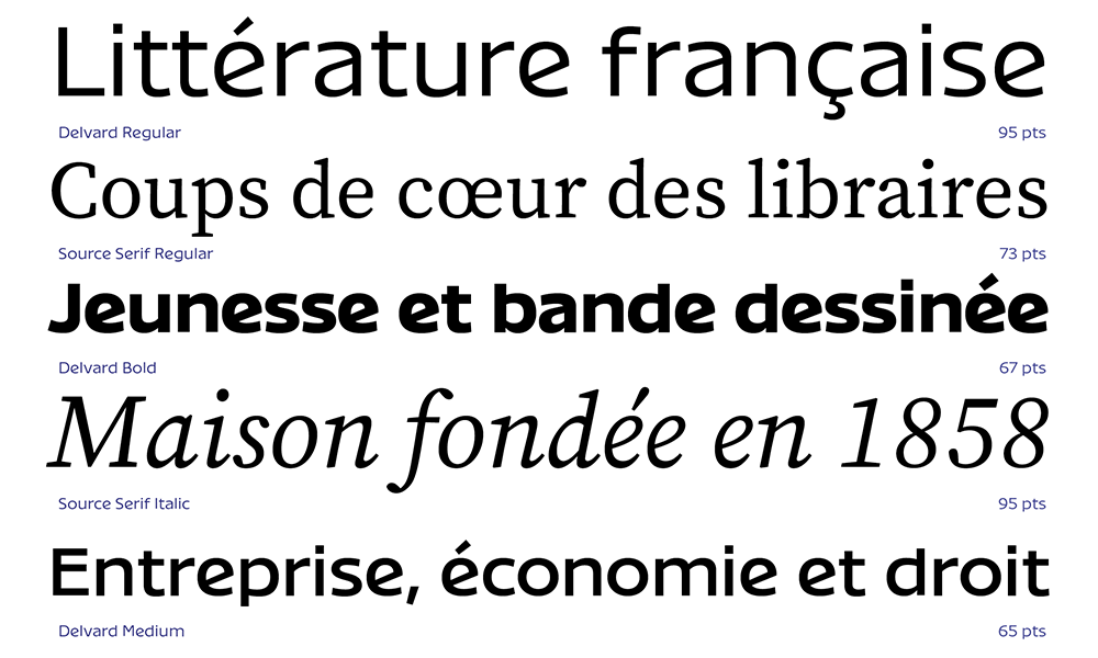
Contrasted type choices
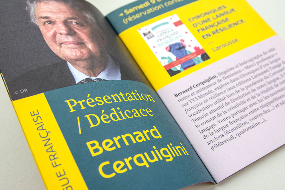
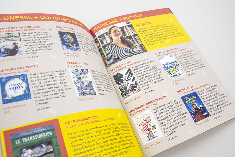
Delvard is inspired by the Art Nouveau posters corresponding to the first decades of the life of the Durance bookstore. Its large proportions and its lack of contrast make it readable for titles as well as for ordinary text. Source Serif is an open source serif typeface that complements Delvard to increase the means of prioritizing information

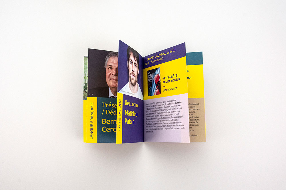
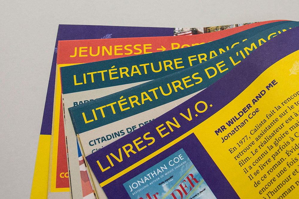
A modular graphics system
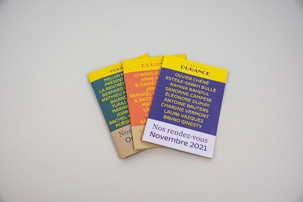
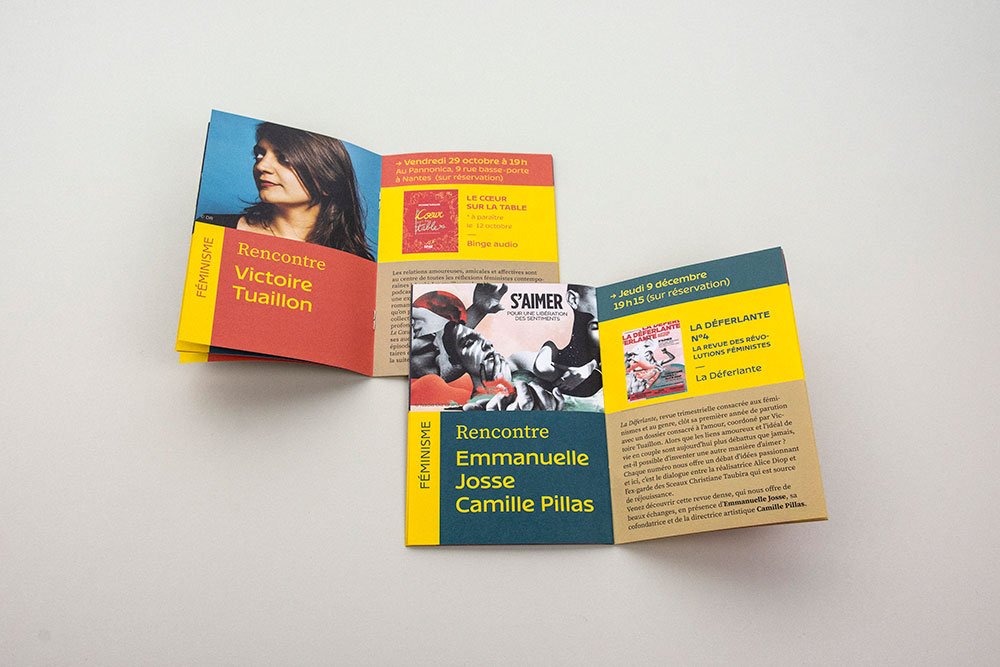
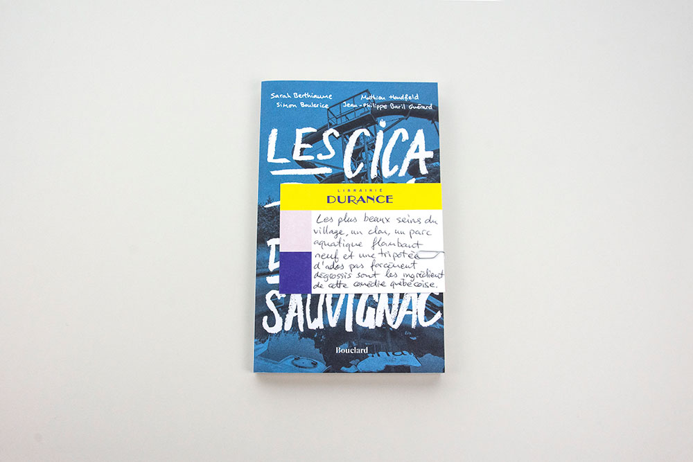
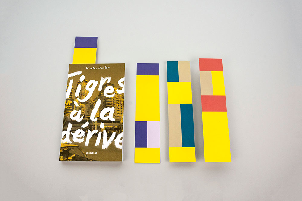
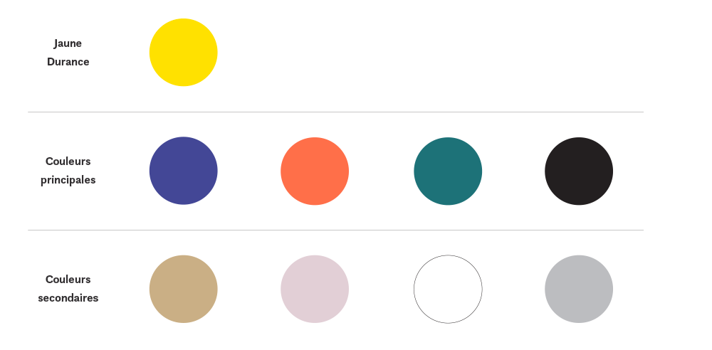
The graphic system or principle of layout, is based on the idea to perceive the bookstore as a house with different rooms evoking different areas of reading. These are represented by blocks of colors of different sizes giving a strong identity and structuring the information. This also makes it possible to evoke books and comics by their rectangular shapes. The whole being designed as a simple and modular system in order to facilitate the internal layout work.
