Gingerminds logo improvement
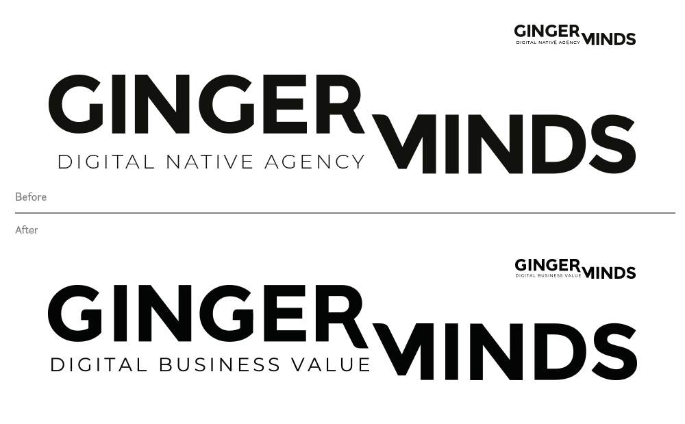
The web agency Gingerminds which help companies in their digital transformation has recently re-thought its identity and its logo. Initially the team carried out numerous tests internally without being able to find a definitive solution. So I accompanied them to improve their tracks, test a few options and finalize their logo.

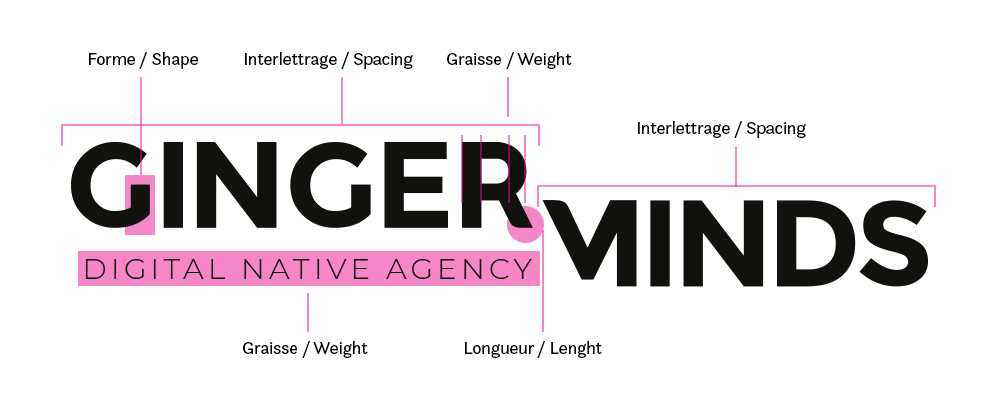
The initial work was to define the elements to improve: the recognition of the letter -G- so as not to be able to confuse it with a -C-, the letter spacing which can be increased in order to improve readability in small sizes , the thickness of the -R- which does not seem to be uniform, the weight of the baseline which seems too light and finally the length of the leg of the -R- which can become more visible and create a parallel with the -M-.

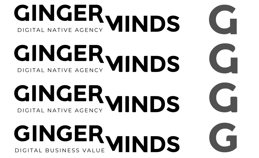
Once these first elements were modified, we tested several options, both for the shape of the -G- and for the shape of the letter endings, either straight, slightly rounded or a mix of both. Comparing these different options has helped us to clarify our choices.

Â
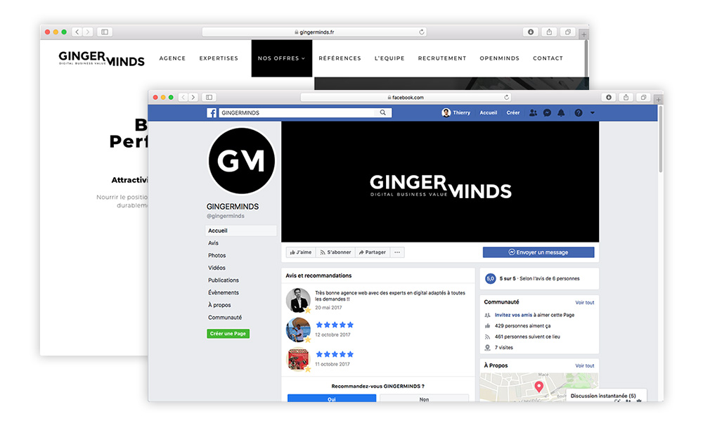
Finally, we had to create an "avatar", an optimized version of the logo for social networks and test the whole before finalizing the design.
Â

Â
Â
Â


