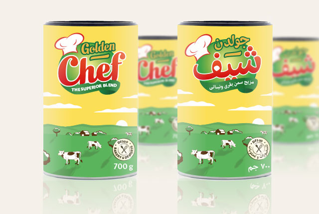
Golden Chef revamp
The Egyptian food group Sakr asked me to redesign the logo of one of their product: Golden Chef, a brand of ghee (clarified butter used for cooking in some Arab countries). The challenge was to redesign both the Latin version and Arabic one ensuring harmonization between two scripts respecting their own features. I also redesign entierly the packaging.


![]()
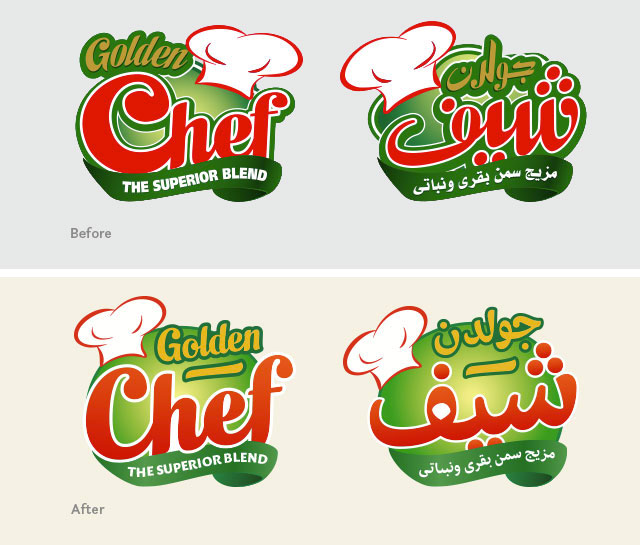
All the colors changed to be less aggressive and more "foody", some elements of the logotype switched to create a more unified logo than an addition of disparate elements.
![]()
All the letter shapes were redesigned in particular the C and the ascenders of h and f both for a better legibility and integration with the other part of the logo.
![]()
The typeface of the baseline changed for a more "foody" aspect and better readability.
![]()
Like for the latin logo, the number of contours is reduced, the shapes are simplifed and clearer, less confusing.
![]()
The shapes of the old logo wanted to match the Latin logo by copying its contrast and its shapes. But because arabic has its own features, I redesigned it to be more faithful to arabic writing taking care of the matchmaking with the latin.