


Eye for detail
I wrote an article for the #10 issue of Papier-Machine review which deals each time with a different word, the last being "Magnifying glass" the issue of attention to detail in typography seemed relevant. This review is only printed (in French) but exceptionally, I had the opportunity to share this article with you in digital format and I invite you to read this wonderful review!
Our everyday world is made up of things that we often don't really pay attention to, as if they had always been there. At the same time, we forget that there is always someone, a job, behind everything. Who thinks of the engineer when he makes a phone call, who thinks of the road worker when he walks in the street, who imagines the printer when he buys a book ...? The same goes for this text. To make it exist, it took an author, a proofreader, an editor, a printer, a distributor, a bookseller, a client (you) and also ... a type designer.
It is precisely my job: I am a freelance type designer. My job is to design letterings, logos, sign paintings and typefaces. A typography or a typeface is a set of signs (letters, numbers, punctuation) having the same style. Lettering is a specific design of letters, imagined for a word, phrase or logo. One can say that I am an artisan of the letter. I can work for clients as well as create a typeface that will then be sold on distributor websites, much like a musician selling his records in a store or online. The goal of my work is that the letter design that I am going to create conveys the desired values or emotion, like the Mirage typeface that I designed for the magazine Le Cercle on the theme of dreams. Letters are like dreams: evanescent.
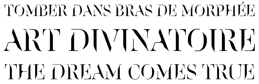
Mirage typeface custom-made for Le Cercle magazine.
In order to create letters, I start from sketches to develop tracks and then carefully develop a complete typeface on a computer. Such a passion for detail inevitably creates a professional distortion. Each sign, logo, advertisement, packaging that appears to me is unconsciously analyzed. I remember one day staring very closely at a poster in the street, my partner called out to me: "Are you okay? I'm not bothering you ?". I took a few steps back: I stood in front of a lingerie ad, observing a logo delicately placed on the body of a beautiful woman. I am a type designer, for sure.
Typography is everywhere. You just have to think about how your day unfolded to get an idea. When you get up, you look at your alarm clock or your laptop, whether on an HD or LED screen, the time is displayed in a different typeface depending on the nature of the medium. Then, passage to the shower where the packaging of shampoos, soaps and other creams compete creatively to evoke, thanks to the letter shapes of their logo, the natural aspect of these products. Once at breakfast, you are also caught between the Bonne-Maman jam whose design of the letters expresses the tradition and your coffee which seems to display its militant side for a fair remuneration of the producers. On your way to work, you pass many types of signage: road signs, bus stops, metro line ... These signs are made to guide you safely to your destination. On your way, you come across a large number of store signs and posters, where each typeface evokes a very different world. Perhaps reading a novel will have accompanied your journey, in which case typefaces designed for continuous reading will have been faded in favor of the story as we will see a little later. Once you got to work, you probably had to deal with written documents, instruction sheets, emails, letters ... They all use typography in one way or another.
Letters are omnipresent in our lives. Every sign you are reading right now, comma, -g-, period, -a-, hyphen was designed by what is called a "type designer." At the beginning of Latin printing around 1450, punch engravers worked with steel sticks until they obtained a three-dimensional sculpture of each letter. It took between half a day and two days to make a six points -e-, a shape one millimeter high. It's dizzying when you think about it. This work of detail, precision has always existed, and this from the beginning of typography. Today, every written sign called a "glyph" has been drawn on the computer as curves connected by various points. These lines are called "Bézier curves", named after the inventor, Pierre Bézier. A French engineer for Renault company in the 1950s, he developed this digital layout to draw car profiles, much more practical than a layout with tools!
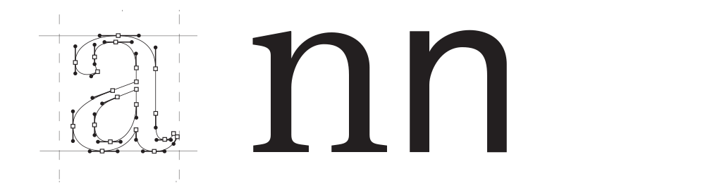
A -a- drawn with Bézier curves / A -n- with and without serifs.
The type designer keeps moving from micro-typography to macro-typography. Any change he makes to a letter, such as the shape of a serif, de facto affects others and therefore affects the overall appearance of the paragraph. For example, if we decide on a certain level of contrast, on the presence of serif or not, this changes what we call the "typographic gray", that is to say not the color of the characters that remains black but rather the general aspect of the paragraph, light or dark, airy or dense as here:
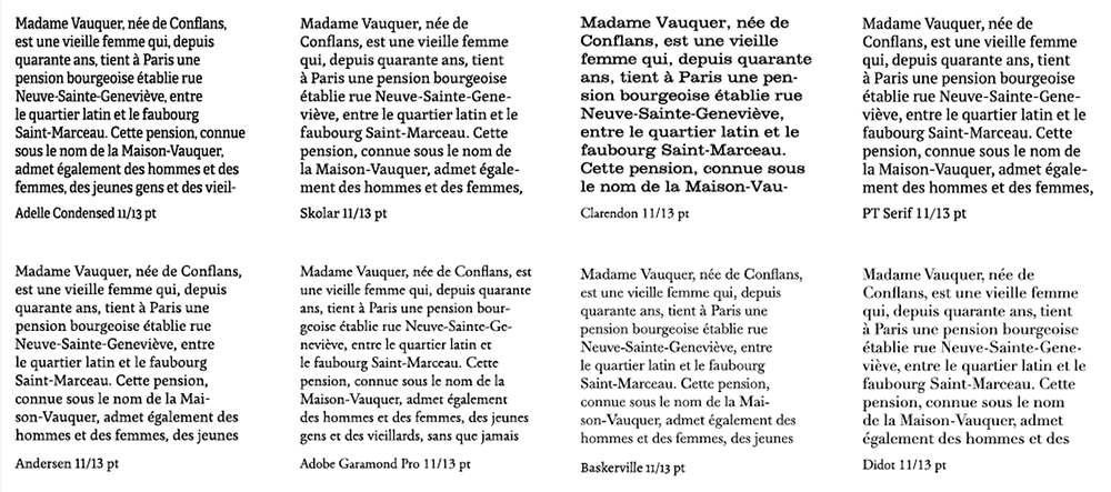
Text blocks with different “typographic grays”. Either different levels of density or clarity.
"But why are you doing this job?" Are there not enough typefaces already? We sometimes hear. This question comes from the ignorance of this discipline. Would it be asked to an automobile manufacturer or to a ready-to-wear brand? Why do we imagine new clothes when there are already so many models, colors, sizes, patterns, materials? The reason that pushes to design new typefaces is the same as in other sectors: creation, the desire to offer new products, technological innovation, the need to provide tailor-made solutions, to revive historical models. …
In the case of a title font, we can make sure to have expressive and recognizable shapes. This is less the case in a text typeface designed for immersive reading, such as in a novel, for example. But this painstaking work is seldom perceived, because for the reader, it is the text, logically, that matters. Most people do not have a conscious relationship with the shape of letters. In a 1948 article, Stanley Morison, the creator of the Times New Roman typeface, wrote: "When readers fail to notice the accomplished reserve and exceptional thoroughness of a new typeface it is probably because of its quality." Later, in the years 1960-1970, Swiss type designers created fonts like Avenir, Univers or Helvetica. These were intended to be neutral, clear, sober because what took precedence was the transmission of the content. Type designer Adrian Frutiger once said, “If you can remember the shape of your lunch spoon, it means that it was wrong. The spoon and the letter are tools, one is for taking food from the plate, the other for taking information from the page. When the design is good, the reader is comfortable, because the letter is both commonplace and beautiful." In his vision, the letter fades in favor of the text, the drawing in favor of the meaning. During an opera, the orchestra is hidden in a pit, it is hidden to better focus on the actors, singers and dancers. The music brings the whole thing to life but we don't see how it works, how it is sets in motion: what matters is the action taking place on stage.
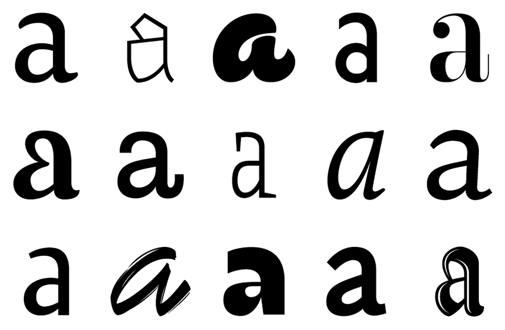
Without having precise knowledge or terms , nor from their history, most of us can identify many types of letters: handwriting, text faces, Blackletters, round or angular shapes ... My father does not know the term Uncial but knows how to say that this typography evokes a Celtic universe. The reader is a typographer who ignores himself, with knowledge like "under seal". In 1986, the Dutch newspaper Trouw abandoned the Ionic typeface in favor of the Frutiger, so it went from a serif typeface to a modern sans serif one. This change led to many complaints and a drop in readership. A decade later, the decision was made to change the layout and typography back to a contemporary serif typeface: Swift. This change made sales take off again. In 2010, Ikea decided to change its accompanying font (typography used on all of their media). The Swedish brand has moved from Ikea Sans (modified version of Futura) to Verdana. This change has created controversy among customers and Internet users. There was even a petition to go back to the previous typeface - with netizens finding the Futura typeface more aesthetic, simple, and universal.
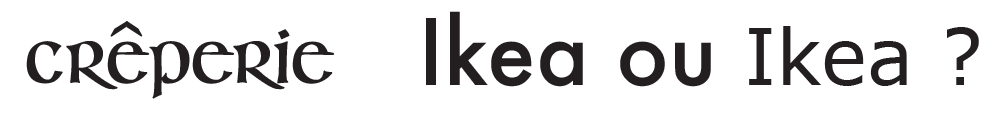
Typography inspired by Uncial calligraphy. / Futura and Verdana typefaces used by Ikea brand.
The typefaces are sometimes the subject of eternal and passionate debates such as around Helvetica or Comic Sans MS. Helvetica is one of those Swiss fonts I was talking about above. Designed in 1957 by Max Miedinger, neutral and very uniform, it has been used extensively. In the 1970s, that was THE font. It is found in the logos of Jeep, American Apparel, The North Face, Tupperware, Orange, Scotch ... It is so global that there is even a documentary dedicated to it (Helvetica, Gary Hustwit, 2007). It is both its neutrality and its omnipresence that tiresome it, so much so that some people hate it. Yes, you can hate a typeface. Helvetica is considered by some designers to be the basic choice that will work all the time regardless of the context. A bit like that white shirt you put on all the time, it's beautiful it's true, but maybe it would have to vary from time to time, right?
Comic Sans MS, meanwhile, was designed in 1994 for Microsoft Bob, a fairly educational office software where an illustrated little dog gave advice to the user in a text bubble. This text was originally written in Times New Roman, which did not match the playful tone of the software. Vincent Connare therefore designed a font inspired by American Comics, hence the name. Finally Comic Sans MS will be integrated into another software, Movie Maker, and this typography will be installed by default on Microsoft 95. This is the opening of Pandora's box: this font with human and imperfect shapes has been used extensively in both for birthday party invitations and on ambulances, for court signage or on graves ... Do me a favor: avoid using this typography in irrelevant contexts, you will be nice. Websites have been created against Comic Sans, one can buy "Ban Comic Sans" stickers. So this font is like that weird guy in your company: you don't like him, you think he sucks, but some of your collegues love him and he will stay there for a long time, that's how you have to deal with it. These debates are like a running gag, they go on and on. Personally, I would rather love new typefaces than hate old ones.
Comic Sans MS typeface.
Of all design objects, letters are undoubtedly the most present and paradoxically the least seen. The type designer is to reading what Mrs. Columbo is to a police investigation: an often invisible centerpiece. Within graphic design and visual communication, typography is a field in its own right, which has its own history, its vocabulary, its researchers, its designers ... It is therefore a profession and a constantly evolving discipline. The beauty of it lies in the amount of constraints it imposes, compared to the immensity of the possibilities it offers. The proportions and shapes of the letters must be respected, legibility guaranteed, it must be able to work in black and white whatever the medium ... And despite everything, we constantly see new typefaces appear. The field is vast, this article will have been only a glimpse; giving you, I hope, the desire to take a closer look at these letters which populate our lives from A to Z.
Text and pictures: Thierry Fétiveau – October, 2020. All rights reserved.
Further reading:Papier-Machine magazine