


PARI: design of a flexible identity
The Maison de l'Architecture des Pays de la Loire contacted me to create the visual identity for a new award: the Innovative Resilient Architecture Award: PARI. This award highlights architectures which rise a movement of mentalities, in particular through resistance to the long term, the ability to forge social ties, adaptability to evolving uses, constructive sobriety and of use. 
Inspirations & concept
The client wanted this visual identity to be only typographic and the logo to be the heart. This choice evokes the idea of sobriety and adaptability. So I had to design a simple and flexible system allowing it to adapt to any type of support and to live in long time.
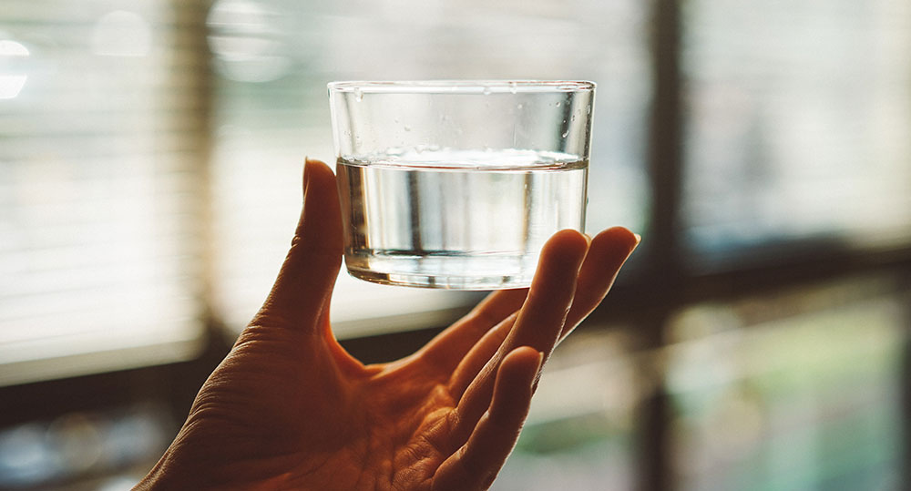
So I was inspired by the properties of water, because it always adapts to the shape of the container in which it is poured. The idea is that resilience and innovation are capacities that require constantly repositioning, adapting, transforming. So I imagined a logo with multiple forms, which, like architecture, adapts to situations and challenges.
Design & function
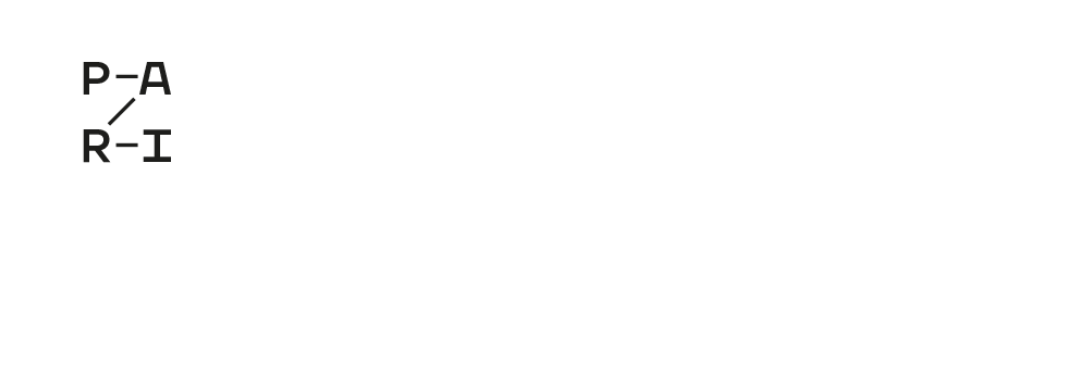
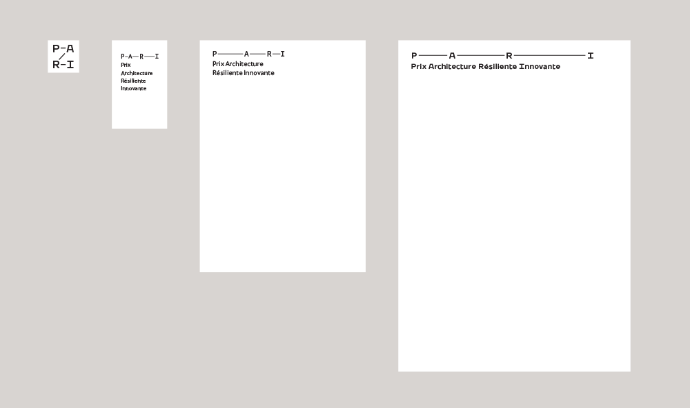
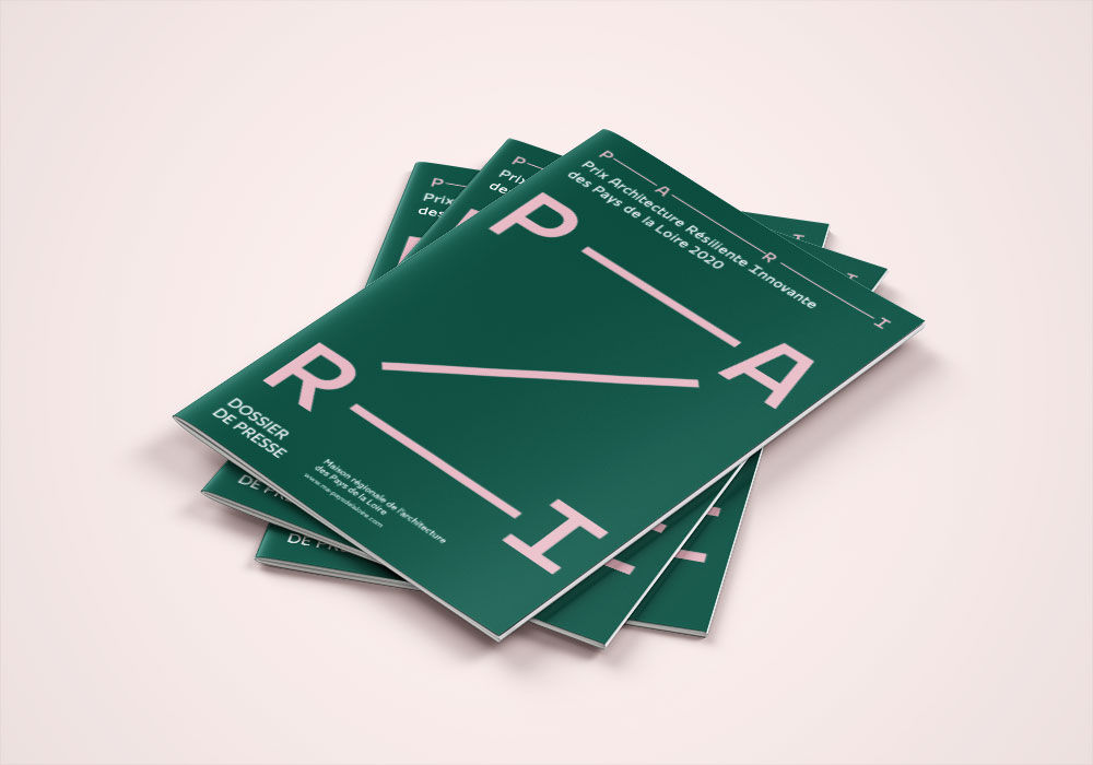
This logo does not have a version, but four, it is multifaceted, works from the avatar of social networks to the press kit, from the poster to the scenography.
The use of the logo depends on the size of the support, whether on paper or on screen:
• Social media avatar = mini
• Business card or below = short
• Between the business card and the A4 = medium
• A4, posters, 4 x 3 and more = long
One can of course imagine variations such as using the "mini" version of the logo in large format in order to occupy the space of the page..
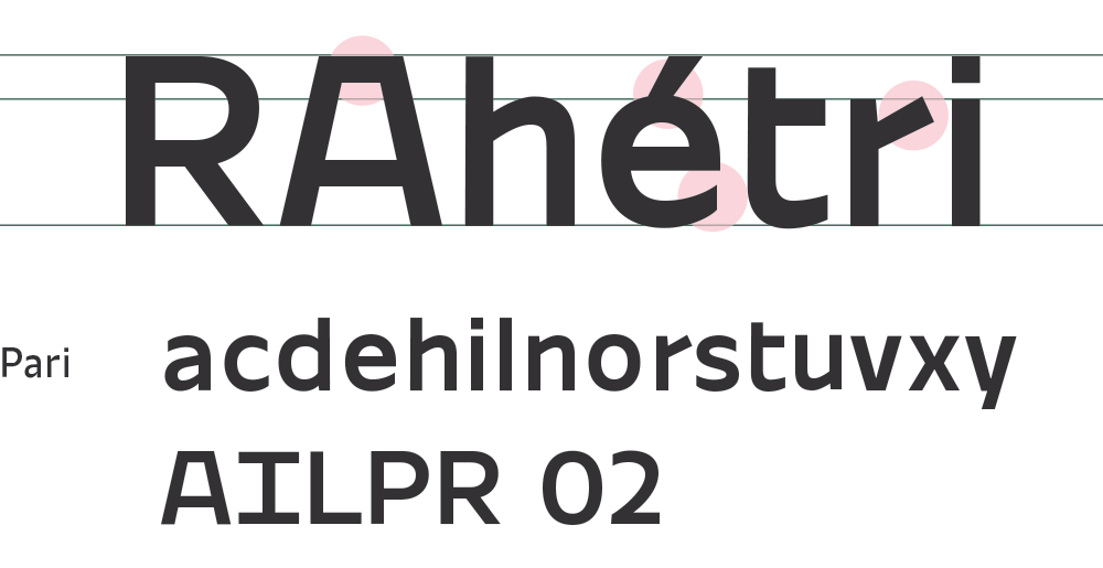
Custom typeface
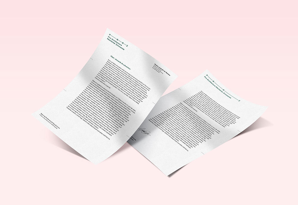
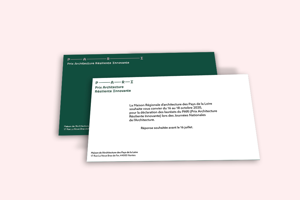
For the logo and the full name of the award, I created a unique typography. It is characterized by its technicality and its clean shapes. The proportions are quite narrow, both in width and in height so as to gain maximum space and have more impact, so the capitals are almost as large as the lower case.
Chromatic identity
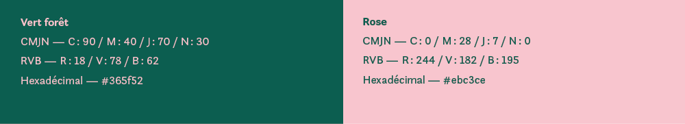
I chose a restricted and contrasting colored range to guarantee readability and price identification. Green evokes ecological issues while pink illustrates the dynamics and momentum of this project.
Applications
The logo can be used as a very strong graphic element as on the cover of the press kit where its presence in two forms illustrates its strong capacity of adaptation. Similarly, on supports such as an invitation or letterhead, two versions of the logo can be used on the front and back depending on the space available. This possibility creates an illusion of motion of the logo when the object is turned over.
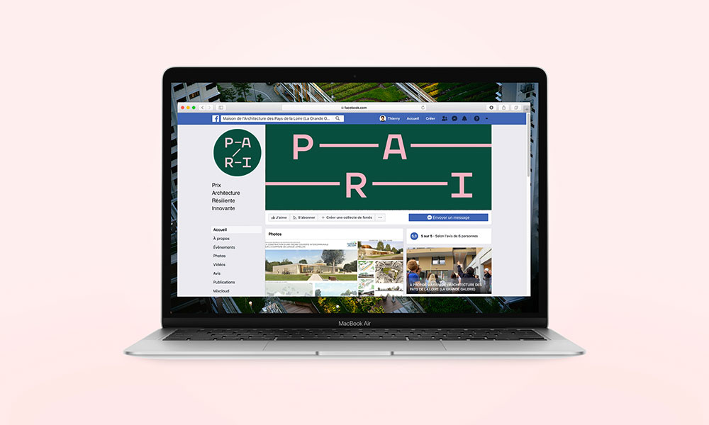
This system was designed to adapt to the web, like on a Facebook banner, where the logo seems to go out of the frame and then reappear.
By designing a simple and flexible system, I was able to both meet their need for sobriety of construction and resilience, but also to think of a principle that could work over time regardless of the nature of the supports. This collaboration with the Maison de l'Architecture once again demonstrates all the conceptual and creative parallels that exist between typography and architecture.