


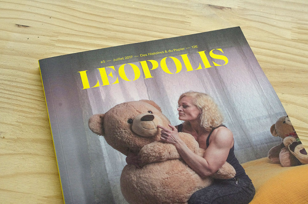
Leopolis magazine logo redesign
The heads of the photojournalism magazine Leopolis have contacted me for a redesign of their logo. The goal was to restore both graphic strength and a recognizable identity to the logo. So I worked on capitals to gain in impact but at the same time conceal details; a work of fineness, like the magazine's reports.


![]()
![]()